How to read a loss curve
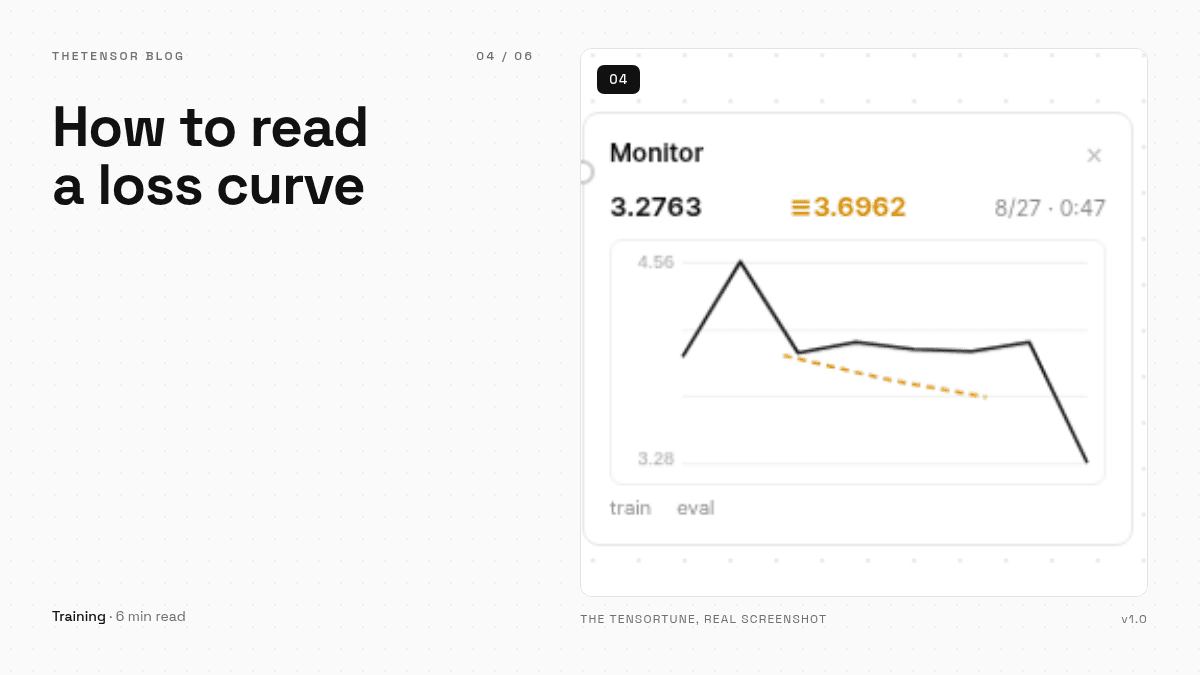
A loss chart is the most direct look at a training run. What a healthy curve looks like, what a learning-rate blowup looks like, how to spot overfitting early, and what the eval split is really for.
When you press Start in TheTensorTune, the monitor block starts drawing a line. That line is the most information-dense thing in the whole app, and most people are never taught what to do with it. A loss curve is not a score — it is a full report of the run, and once you know the four or five shapes it can take, you can read a run at a glance.
What the line actually is
Loss is the model's surprise. Each training step, the model takes a batch of your samples, guesses the next token, and measures how wrong it was. A high loss means it was very wrong; a low loss means it saw your answer coming. Training means nudging a few million numbers so that next time, the surprise is smaller. The chart in the monitor draws one point per step, plus a second, dashed line for the eval split — the slice of your data the model never trains on, kept aside as an honest check.
The healthy plot
A healthy curve falls fast at first, then flattens as it approaches a floor. In one of our demo runs — a small instruct model on thirty-six support-agent samples — training loss fell from about 4.0 to 1.4 over ninety steps, and eval loss followed it down. That shape means the model is learning the data's patterns and not just its exact words, because the eval samples were never shown to it. When the dashed line follows the solid one down, believe the run.
The blowup
Sometimes the curve does not fall — it climbs, or snaps into a jagged zigzag that gets worse each step. That is almost always the learning rate. The learning rate is the size of the nudge: too small and nothing happens, too large and each step overshoots, and the model gets worse instead of better. We once set it to 1.0 during testing (do not) and watched the loss shoot straight up. For LoRA, 2e-4 is a well-tested default. If your curve blows up, lower it and start again — a blown run is not worth saving.
The slow lie: overfitting
The sneakier plot is when the solid line keeps falling but the dashed line turns and climbs. The model is memorizing your training samples word for word, and its performance on data it has not seen is getting worse. On small datasets — which is most datasets people fine-tune with — this happens after a couple of epochs. It is not a catastrophe; it is information. Either stop there, or drop to fewer epochs. TheTensorTune's early stopping watches the eval line for you and halts a run that has stopped improving.
One more number earns its place on the screen: perplexity, which the comparison view reports for base and tuned models. It is the loss converted into “how many words was the model torn between, on average” — lower is more confident. Watching it drop from 55 to under 9 on the eval split of our demo dataset was more satisfying than any loss number, because it was measured on data the model had never trained on. That is the whole point of keeping an eval split: it turns a feeling into a number.